Producing, designing, and maintaining websites is fun.
A website designer’s job is to make websites look noble and easy-to-use for visitors.
For that, different designers use different tactics. They want to give a site a kind-of structure that appeals to the audience at a very positive level. They work on visual assets for better user experience (UX), which can give the website aesthetic value.
Moreover, they use graphic design (different layouts, compositions, graphics, colours, typography, alignment, and negative space), user interface, and user experience design (UI/UX) strategies and sometimes go for authoring like proprietary software.
Among these basic website designing rules, there are more powerful techniques, such as the golden triangle and golden ratio, Z-pattern, F-pattern, etc. that UX/UI designers uses to reach a well-structured website goal.
If this is your first time hearing these words, read on.
In this blog, you will explore the “Golden Triangle” method in website design, why website designers need to know about it, and how we can use it to improve visitor engagement.
But before we begin, glimpse our website design services in the UK. We provide clients with UI/UX and user-friendly websites. Call us now.
Now, let’s begin!
What is the Golden Triangle?
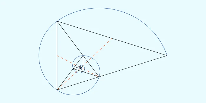
The idea of the Golden Triangle is built via eye-tracking studies that looked at the patterns people’s eyes follow when they go to a search results page for the first time on a desktop computer.
These studies have shown that people pay more attention to some parts of the search results page than others.
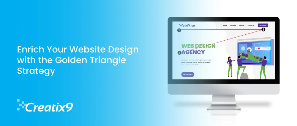
This triangle has three important places: the top left, the top right, and the bottom left.
- Top left corner: This is where most visitors begin to scan a page. It is connected to the first few search results and is considered the most important space on the SERP. Visitors usually read from left to right, beginning in the upper left corner.
- Top Right Corner: Next, users look to the upper right corner to see more search results and may look for extra information or different links. This area isn’t looked at as closely as the top left, but it’s still essential.
- Bottom Left Corner: This is the triangle’s last point. People looking for more information or encouragement before making a choice may skim this section after looking at the top results.
- The general public thinks that reading habits, cultural rules, and design standards contribute to this trend.
However, how does this relate to the pages of a website? Perhaps you’re wondering. People also look at websites in a triangle shape, with the top left corner of the page getting the most attention. This makes it crucial for website design services or developers to prioritise content and features accordingly.
What significance does it hold?
Knowing about the Golden Triangle can significantly affect how website designers organise and rank information on a page.
We can make it more likely for users to notice and interact with significant parts of the site by aligning names, navigation choices, and calls to action within the particular area. This can make the audience more likely to buy, make them happier, and eventually make the websites we create more successful.
The following outcomes are possible when applying the golden triangle theory to website design:
- More sales: Calls to action (CTAs) placed inside the golden triangle are likelier to see and click on by users.
- Better user experience: Putting essential parts of a website in places that are easy for the audience to find can help them find what they’re looking for and move around.
- Better brand recognition: putting your name in the upper left can help people remember your brand. It’s important to remember that the golden triangle is just a suggestion.
How visitors use a website will depend on its goal and style. Nonetheless, it’s a helpful tool for web designers to take into account when developing user-friendly and functional layouts.
How to implement the Golden Triangle?
How can we use the Golden Triangle to help us with our website design project? These are some ways: –
- Use of visual cues—we use shapes, colours, and images pointing in specific directions to draw people’s attention to essential page parts.
- Set priorities for the content. The content is organised in a hierarchy, with the most important information in the triangle and the least important information in other parts of the page.
- Test and repeat: We find it helpful to use tools like heatmaps and A/B testing to get information about how the audience uses your site and to keep improving designs based on what we learn from using them.
- Strategically place important parts—we figure out which parts of a webpage are the most important, like the title, headline, and prominent call to action, and put them in the Golden Triangle to get the most attention.
Is the Golden Triangle Principle Relevant to Mobile Devices?
The Golden Triangle is still a helpful way to determine what viewers are paying attention to on desktop computers, but it’s important to remember that audiences may behave differently on mobile devices.
As more people use smartphones and tablets, web creators need to adapt their work to different screen sizes and ways people interact with websites.
We can ensure that your websites stay exciting and easy to use on various devices by using flexible design and mobile-first development methods.
Real-life Firms that apply Golden Triangle on their Websites
Restaurant Property
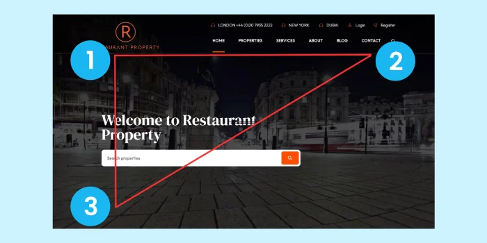
Restaurant Property is the world’s leading expert on leisure real estate. They specialise in restaurants, bars, pubs, and hotels and have many contacts worldwide in the leisure property sector.
They wanted to update their old website to make it look more modern because they wanted to grow their business more.
They apply the Golden Triangle so that the navigation menu, the logo, and the property search bar all fit into the pattern that the viewer’s eyes would follow.
Audiences who come to this business can quickly see what it does and use the search bar to find what they need.
UK Table Sports
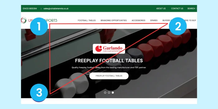
UK Table Sports is the only company allowed to bring Garlando Freeplay football tables into the UK.
A new website design was needed so they could show off these beautiful football tables and build a solid online presence for their business.
Once more, everything a tourist would need is inside the triangle. The name sticks out, the menu is clear and straightforward, and the critical information is correct.
As a result, the user can quickly find the goods from this company without having to scroll down and look for them individually.
Fusion Appointments
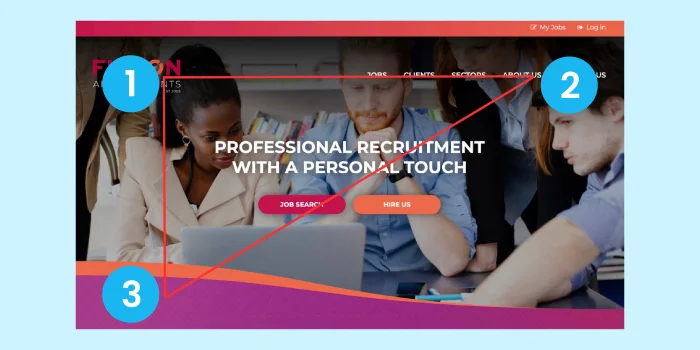
Fusion Appointments is a well-known and respected small employment service known for the personalised way it matches individuals with jobs. Their commitment to personalised service keeps their audience coming back.
The company’s new website had to be very different from its old one. It had to make it easier for clients to connect with the company and for job candidates to apply quickly.
They used the Golden Triangle to ensure that the logo and menu were lined up so that they would be easy for individuals to see. The user’s attention is immediately pulled to the buttons they need to find a job or hire this company.
St George’s Hospital Charity
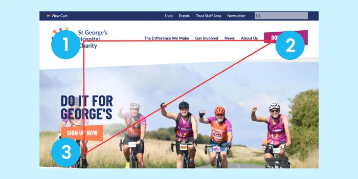
The hospital’s charity, St. George’s Charity, is committed to giving grants and raising money to improve services not only at St. George’s Hospital but also in the areas it serves. Their hard work makes a real difference in the lives of patients, their families, and the staff who serve them.
St. George’s Hospital Charity knew it was important to improve its online exposure, so it created a new website that would spread the word about its cause and make it more visible online.
In their site, they use golden triangle method to make it easy for the general public to donate to this cause. It’s easy to see that there are two buttons inside the triangle. Users will quickly scan them with their eyes to get where they want to go.
Website design services at Creatix9 UK
Our website design service team is committed to creating websites that are visually pleasing and technologically advanced. Our goal is to create a site that is beautiful to look at and easier to use than any other tool you’ve used.
Our professional digital agency knows that your website is an integral part of your online profile and needs to work well for you.
We make our website development services easy to buy, use, change, and add to.
Creatix9 has been building websites for a decade now, and we’re proud to have worked on projects ranging from starting from scratch to redesigning whole websites that need ongoing upkeep.
This might be hitting home because you’ve been thinking your website needs a makeover. If so, we’d love to help you.
Don’t feel obligated to talk on the video call today. Have a free session with us.
We build websites that are more than just following a golden triangle!

